Images
Burrell School
IU-opoly
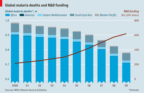
Daily chart: global malaria deaths. The death toll from malaria seems to have responded to a big injection of money. Over the past decade deaths have fallen by 20%; of 108 countries where malaria is endemic, ten are on track to eliminate the disease in the near future.

Why aren’t more emails like this?
Bravely Done
(via Letters of Note: The ring of fire still burns around you and I)
Johnny Cash captures some notes.

I must have one of these installed in the office, STAT.
Where do I get one of these
Happily Cluttered

This is genuinely Microsoft’s idea of a “streamlined”, “optimized” UI for Windows Explorer. They were so proud of it they wrote a blog post about it.
The post is a sort of masterpiece of crazy rationalization, but I think my favourite part may be this screenshot:
Here, they proudly overlay the UI with data from their research into how often various commands are used. They use this to show that “the commands that make up 84% of what users do in Explorer are now in one tab”. But the more important thing is that the remaining 50% of the bar is taken up by buttons that nobody will ever use, ever, even according to Microsoft’s own research. And yet somehow they remain smack bang in the middle of the interface. The insanity is further enriched by this graph:
Again, this is Microsoft’s own research, cited in the same post: nobody — almost literally 0% of users — uses the menu bar, and only 10% of users use the command bar. Nearly everybody is using the context menu or hotkeys. So the solution, obviously, is to make both the menu bar and the command bar bigger and more prominent. Right?
Microsoft UI has officially entered the realm of self-parody.


